Case study
O Rei da Pamonha USA
Ground-up brand presence built for the US market
Full site developed from client needs: company story, product showcase, and a shop page that routes customers directly to authorized distributors. Zero dead-ends in the buyer journey.
Project summary
Timeline
3 weeks
Key results
100%
US market digital presence from zero
Zero
Dead-ends in the buyer journey
4 pages
Story, Products, Shop, Contact
Tags
Project overview
A focused digital product built around business goals
Full site developed from client needs: company story, product showcase, and a shop page that routes customers directly to authorized distributors. Zero dead-ends in the buyer journey.
Deliverables snapshot
- 4-page brand website
- Product showcase with photography direction
- Distributor routing system (shop page)
- Brand story & founder narrative
The challenge
A beloved Brazilian food brand expanding to the US had no digital presence in the American market. Without a site that told their story and connected customers to where they could actually buy the product, growth was limited to personal referrals and in-person events.
Our solution
We built a complete US-facing website from scratch — brand story, product showcase, and a shop page that routes customers directly to authorized distributors. Every page was designed to eliminate dead-ends: if someone is interested, the next step is always clear.
Visual direction
Bold identity. Clear hierarchy.
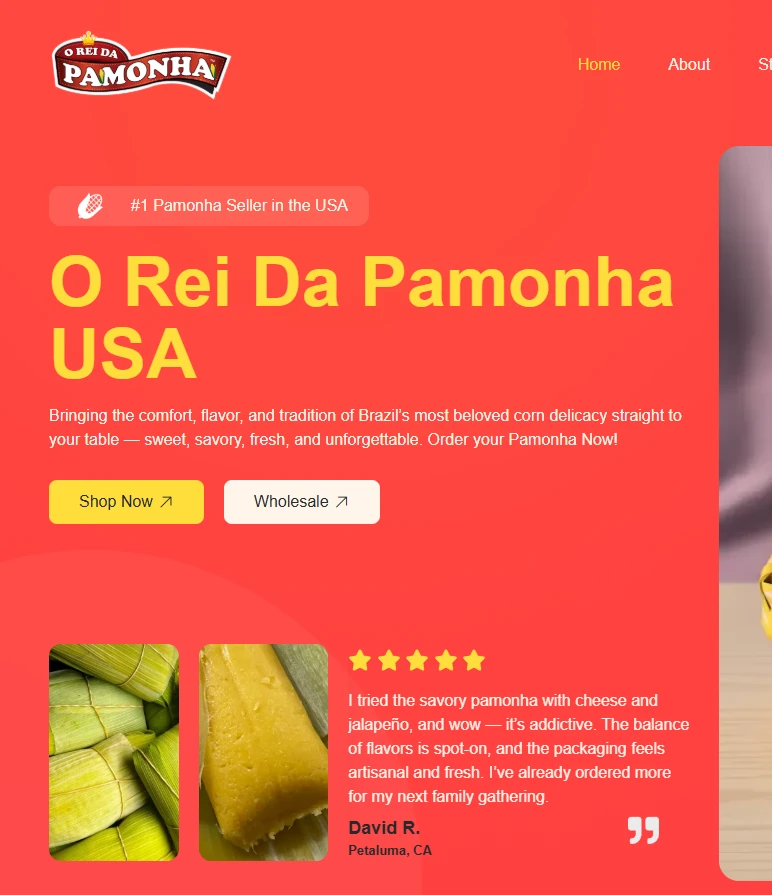
The design had to carry the energy of the brand — vibrant, confident, and unmistakably Brazilian. We built around the client's existing identity, using strong color contrast and clean typographic hierarchy to make every section easy to scan and act on.
Brand-led color system
Vibrant palette anchored by the client's existing red and yellow — consistent across every page.
Conversion-first layout
CTAs visible above the fold on every key section, no hunting required.
Readable at every size
Type scale and spacing tuned for clarity on any screen size.
Mobile experience
Most orders start on a phone.
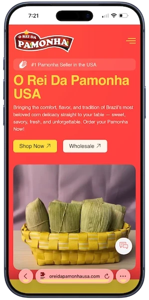
With mobile accounting for the majority of food discovery traffic, the site was designed mobile-first from day one. Every layout, button, and image was optimized for thumb reach, fast loading, and immediate action.
Fully responsive
Layout adapts fluidly across all screen sizes without breaking structure or readability.
Above-the-fold CTAs
Shop and wholesale actions stay visible on load — no scrolling needed to take the next step.
Lightweight and fast
Images and assets optimized for mobile networks so the experience never feels sluggish.
Process
The path from strategy to launch
Every phase was built around the same objective: give O Rei da Pamonha USA a digital product that feels strong, clear, and commercially useful.
01
US Market Research
Analyzed how Brazilian food brands typically position themselves in the American market and where O Rei da Pamonha had a unique story to tell — authenticity, heritage, and a product with no real competition.
02
Brand Narrative
Wrote the full site copy in English, translating not just the language but the brand's essence — turning a beloved Brazilian staple into something compelling for a North American audience.
03
Site Architecture
Mapped a four-page structure that follows the customer journey: curiosity → product understanding → where to buy → contact for wholesale. Zero dead-ends built into every page.
04
Distributor Integration
Built a shop page that routes customers directly to authorized distributors — removing the "where do I buy this?" friction that was previously losing every interested customer.
What we built
Deliverables tailored to the actual problem
Results
100%
US market digital presence from zero
Zero
Dead-ends in the buyer journey
4 pages
Story, Products, Shop, Contact
Ready to build your story?
Tell us about your business. We'll come back with a clear plan for what we can build together.
Start a Project