Content Architecture
Mapped Brazil's tech-news landscape into five clear categories — Tendências Tech, Dispositivos, Reviews, Ferramentas IA, and Repositórios GitHub — so readers can find their interest in one click.
A complete editorial platform for Brazil's tech-curious audience — categorized content, a dedicated exploration hub, newsletter capture, and a structured pitch/contact system for partnerships and story tips.
The Showcase
Content is organized for discovery first — five clear categories, a dedicated browsing hub, and editorial metadata on every article, all built for a Portuguese-speaking tech audience.
Tendências Tech, Dispositivos, Reviews, Ferramentas IA, and Repositórios GitHub — every article has a clear home.
Visit Live Site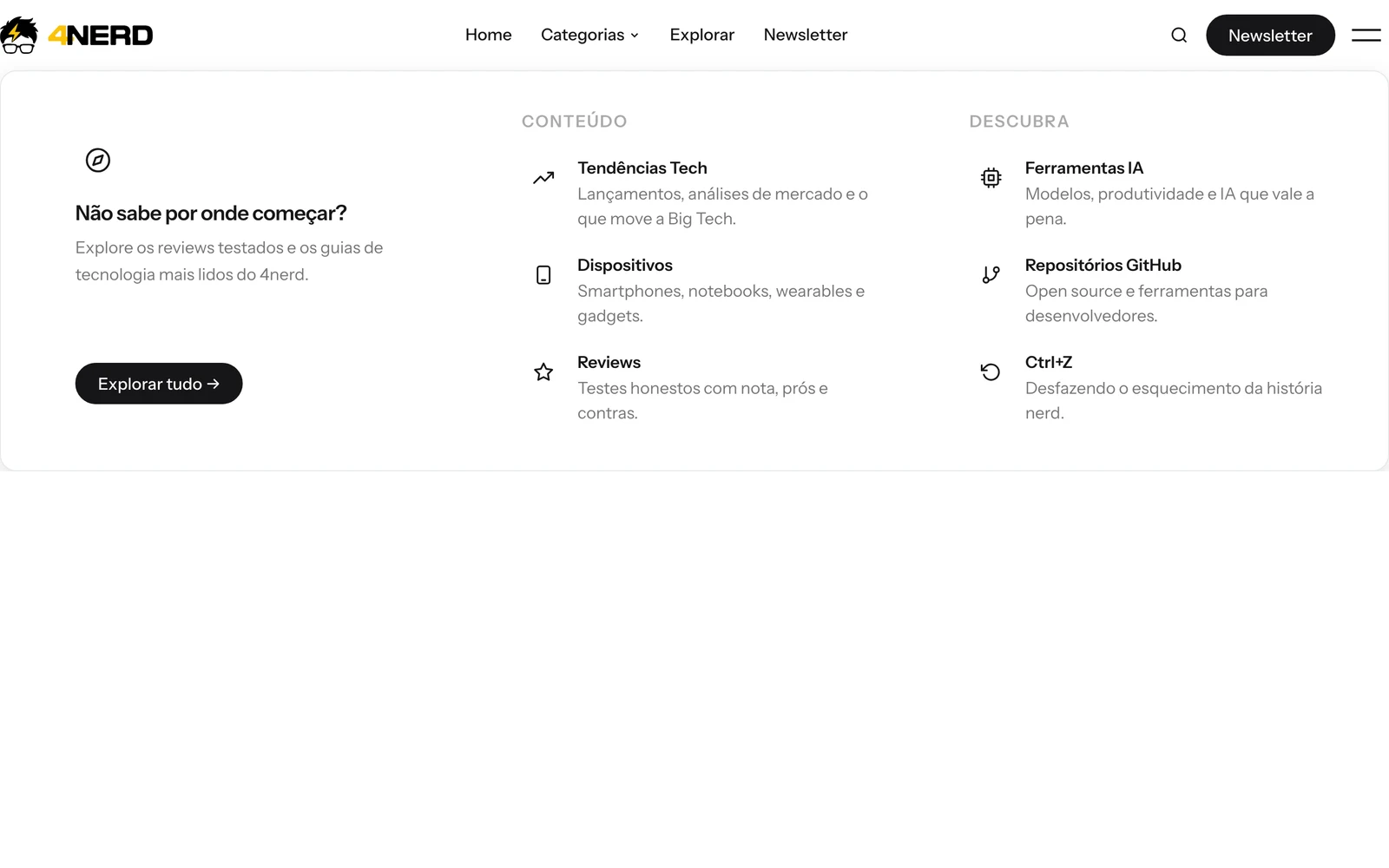
A standalone page for browsing every category at once, not buried in a dropdown.
Visit Live Site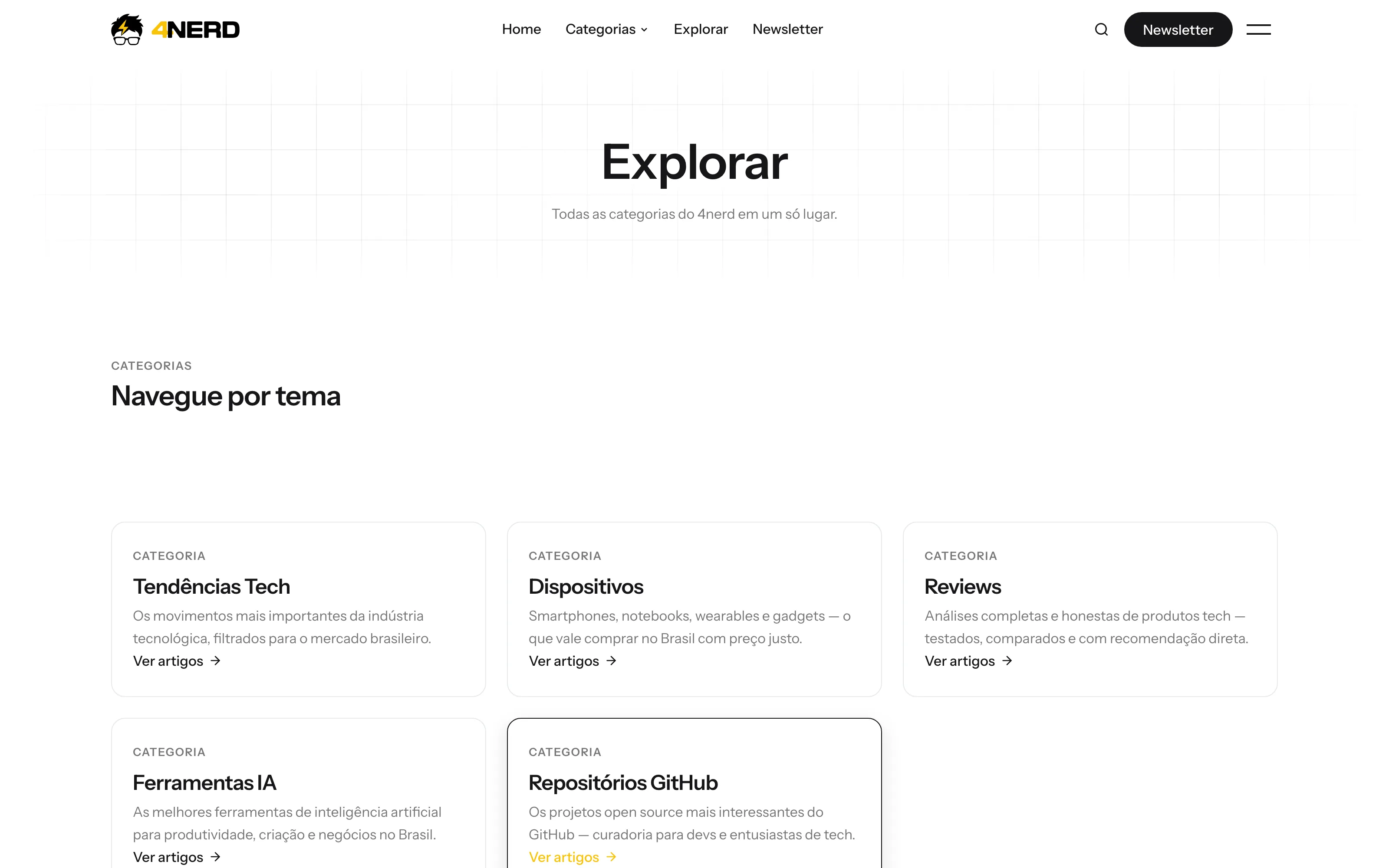
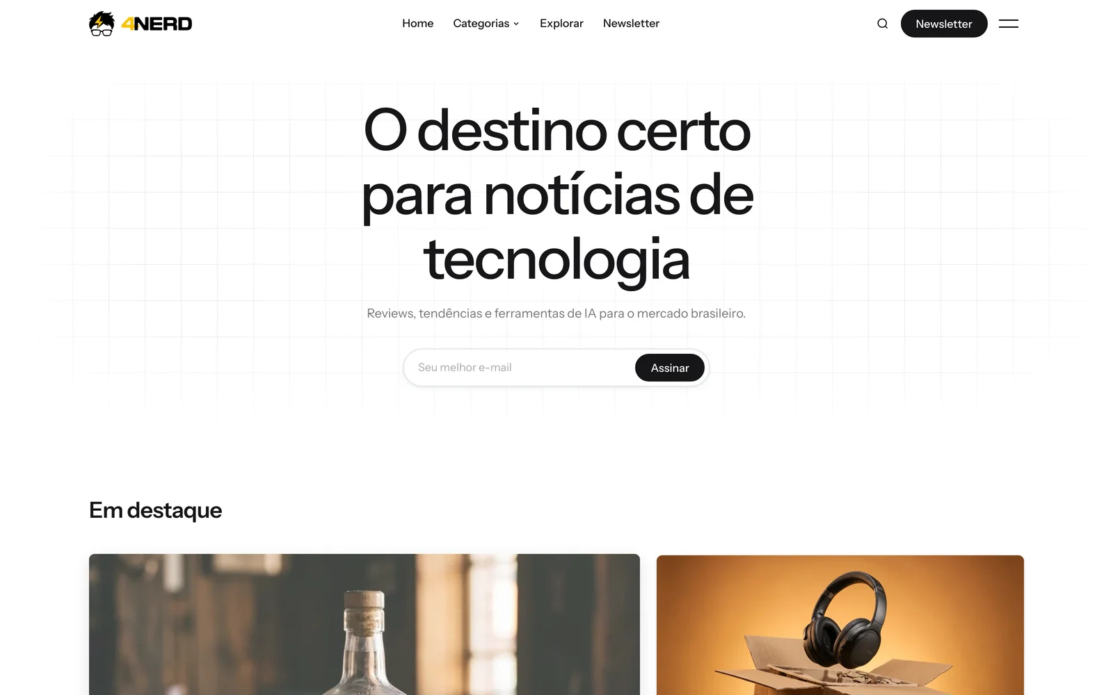
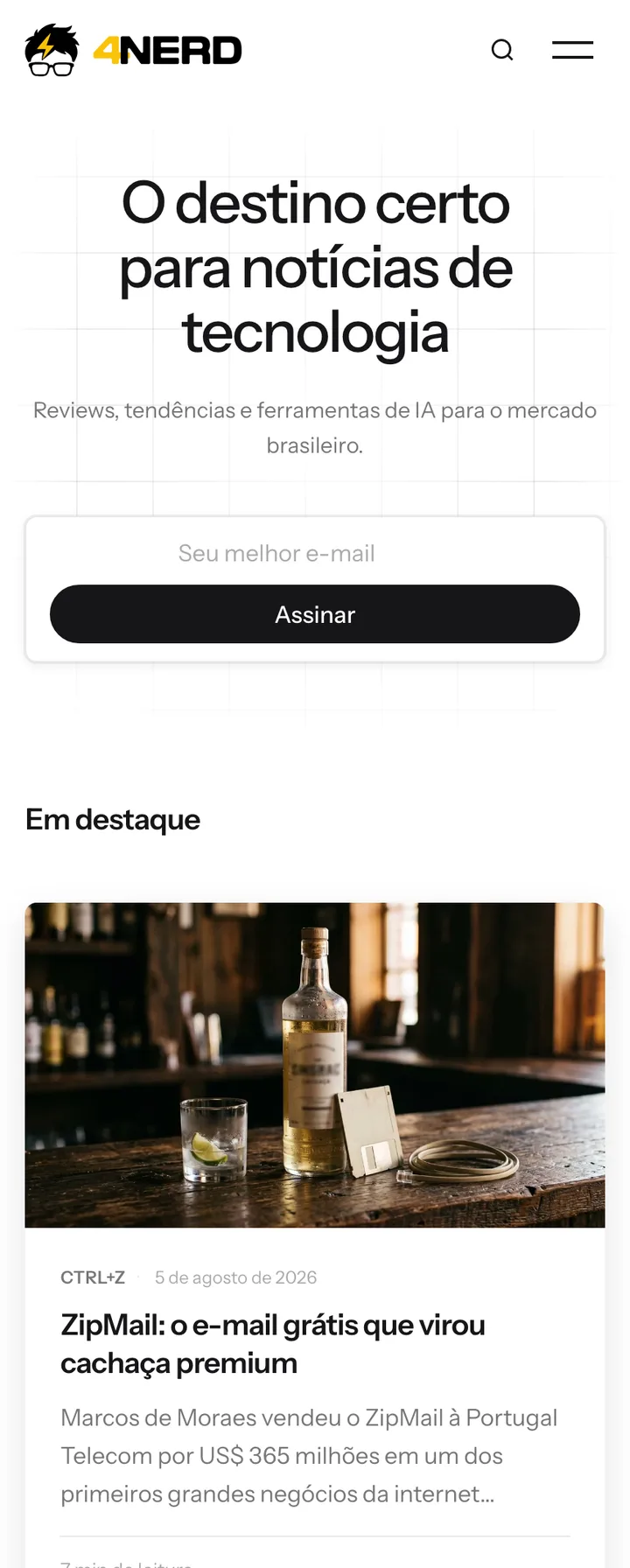
Signup sits directly in the homepage hero, not tucked away in the footer.
Visit Live Site
Challenge & Solution
4nerd needed a real publishing platform, not just a blog — a place to organize reviews, trends, and AI tool coverage into a browsable structure, capture newsletter subscribers, and give partners and readers a clear way to reach the editorial team.
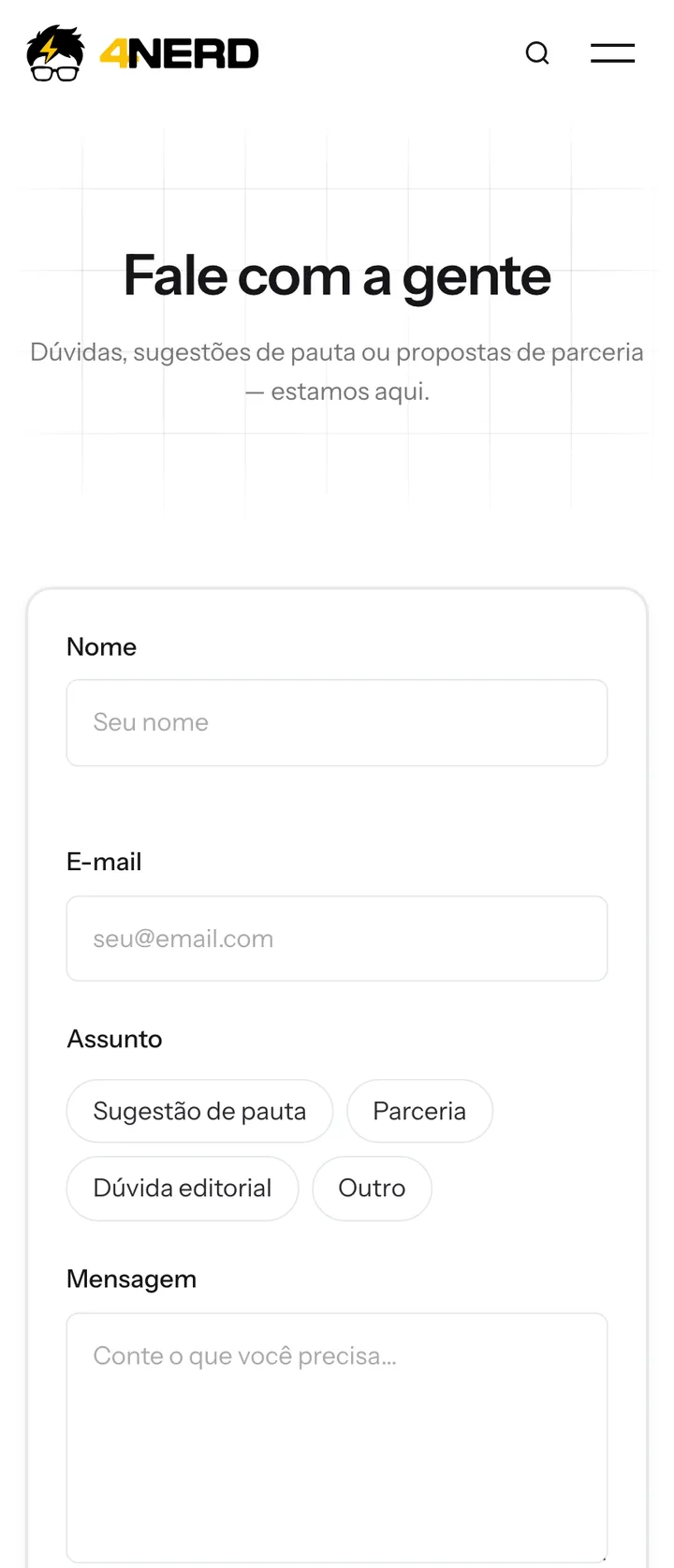
We built a full content platform organized around five core categories — Tendências Tech, Dispositivos, Reviews, Ferramentas IA, and Repositórios GitHub — with a dedicated Explorar hub for browsing by topic, newsletter capture built into the homepage, and a structured contact form that routes pitches, partnerships, and editorial questions by subject.
The Results
Our Process
Mapped Brazil's tech-news landscape into five clear categories — Tendências Tech, Dispositivos, Reviews, Ferramentas IA, and Repositórios GitHub — so readers can find their interest in one click.
Built a full blog system with author bylines, reading time, and category tagging on every article — publishing infrastructure, not just a static page.
Added a dedicated Explorar hub for topic browsing and newsletter capture on the homepage to turn one-time readers into a recurring audience.
Built a structured contact form that routes messages by subject — story pitch, partnership, or editorial question — so the right message reaches the right place.
Built for Mobile
Tech news gets discovered on social and shared on mobile, so the site was built to read cleanly on a phone — from the homepage grid down to a single article.
Layout adapts cleanly from desktop to the smallest phone screen.
Typography and image sizing tuned for comfortable reading on mobile.
Mobile menu keeps every category reachable in one tap.
Also On Mobile
Category pages, articles, and the contact form all carry the same clean reading experience on a phone as they do on desktop.